Posters in the world
Here are a series of posters that show the creative styles that drag people into a specific movie. When thinking about posters from now days and back in the past you can find that people aren't as creative with their work as they used to be. Older posters I find had more pop and more of an original design. These are personalized ideas that carry out both the artist perspective as well as something that no one has ever seen before. This originality is what gives these posters their great qualities that people tend to remember as the years pass.
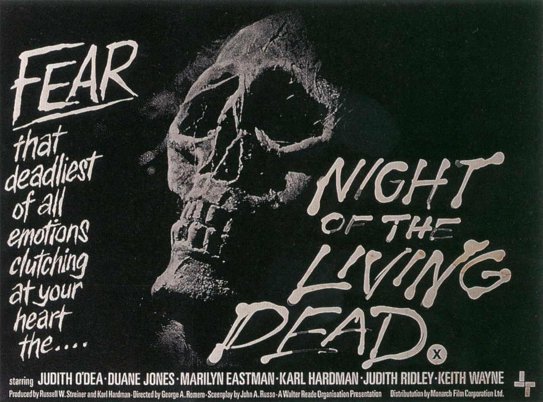
When i think of good posters i generally seem to look at the old monster movie posters. Sure now in our modern era we see horror as blood, gore or darkness but how is this dragging us into the story of a movie. Whatever happened to the realness that gives the poster lifelike qualities that is frightful to think about? In the past people would normally look at the poster or cover of a movie to see if that was something they wanted to watch. Posters would drag people in and it was by that kind of commercial advertising that made some movies become very successful. In our modern era why do we always have to put horror posters into a way that is filled with violence? Where did all the originality go ?
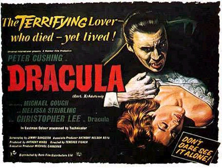
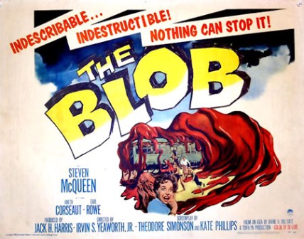
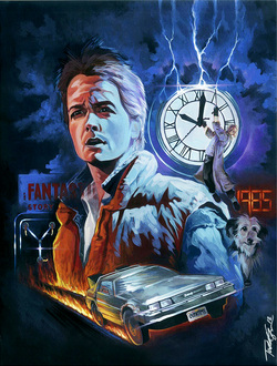
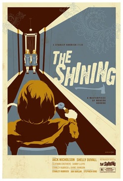
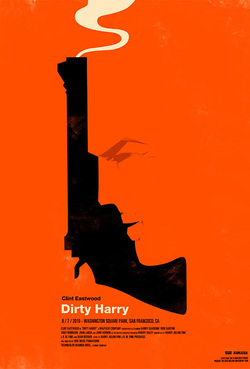
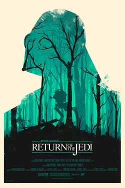
Here are some of the great posters that have been around and remembered for decades...
Here are some of the great posters that have been around and remembered for decades...
Here are a few posters that have captured my attention
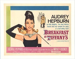
This is an original 1961 version of the poster to highlight the movie Breakfast at Tiffany's. In this poster i love the old modern look which gives the movie class. This classy feel is also a way to advertise the way Audrey Hepburn plays her character. Although she doesn't have much money she still lives in a way that makes her feel special. This poster completely captures the story of the movie, although it is a little plain in the background its that plainness that makes her and the print pop out. The colours used within this poster are light while her dress is a dark black another way to let her pop out from the background. There are three rectangular colours that outline this poster al moving in a clockwise direction. With this clockwise direction it pulls the eye around from the bottom right to the top right where the smaller picture and information of the movie is placed. I also like the way that Audrey's eye contact is on the picture in the back, this creates an invisible line to the second subject matter.
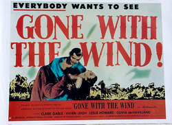
This poster is one that represents a movie with a lot of history as well as love. One of the things that i love about this poster is the fact that all the main points of the movie are put in plain sight. Gone with the wind is one of the classic love films that keep peoples hearts flying throughout the ages and with the use of bold font it helps other become intreated of what the movie is about. the presentation is great when it comes to colour scheme. the red as a bold colour in the front makes the important information pop out, then with the cooler colours in the back it create a sort of depth to the poster that draws in peoples curiosity. with the two characters in the middle of the font it draws your attention to the two lovers and with the expression on their faces it opens you to the feelings that they share making all those romantic movie watchers watching. For the most part this movie poster is great when it comes to depth colour and texture, and is a great creation to best describe the curiosity that fits this film.
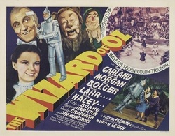
This old classic poster is one that had captured my creative attention for so many reasons. for one i have loved this movie ever since i was a kid and i was always amazed when i saw it turn from black and white into colour. in this poster that is shown here in a creative style that shows the movie in its true form. in the back there is a black and what circle that shows the land of Oz which makes it as if the film is a black and white but in most peoples surprise this movies shocked most with the first film done in Technicolor. i love how the print of the title looks to be in the block like form giving it not only detail but a pop as well. this draws the eye to the title of the movie. now with the angle of the diagonal to the title it creates that invisible line to the back and the front to show all components of the poster. with the tin man standing on the print it crates a depth as well as gives the audience another drawing viewpoint of the cast in the film. the colours used in this poster truly lighten up next to each other as they are opposites on the colour wheel giving both foreground and background a pop. the complete composition of this poster is in full balanced with all components.
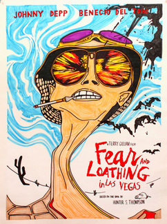
All i have to say is wow. this is a poster that is packed with action from the reflection in the sunglasses to the crazy design in the back. i find with all that motion within this still poster it will defiantly draw the attention in for viewers and capture the attention of people. although there is a lot going on you are able to depict each thing out of the poster due to the different colours in the back ground and the foreground. with the white and light blue in the back it helps the main subject in this poster stand out and pop to the eye. the blue only extends around the head which captures the creative nature in the facial expression to the style in the neck which then meets with the ground. i was really captured by this poster and was creatively drawn into this poster with all the detail within it. with the motion i find it highlights that this film is an action and drama at the same time. with the text of the poster being a red colour it pops out from the rest of the text making it easier for the viewer to see the name of the film as well as the main actors featured in it.
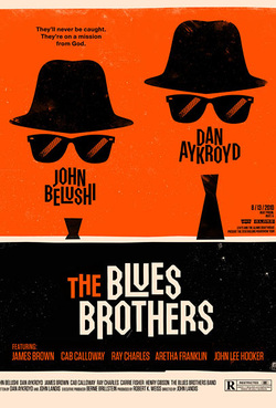
It was on a mission from God, and here it is. this is a poster i must say is classy and creative at the same time. with a background of black and orange it tends to strike the eye and draw in more attention to the true subject in the top. at first glance it seems like its just a had glasses and words but by looking closer in to what the words spell out we see the two actors that play within the film and realize that this is the silhouette of their characters. for the words that turn into a musquash was a great add on and gives this poster a quality that you don't normally see. because of the different sections of colour and in different sizes it helps the eye to look all the way from the top of the poster to the bottom. the colour and eye balance is great. for the uneven hats it gives an invisible line for the eye to travel on as it looks down to the bright popped out lettering in the title. the colour contrast in this composite is all complimentary and helps with the over all presentation of the poster.
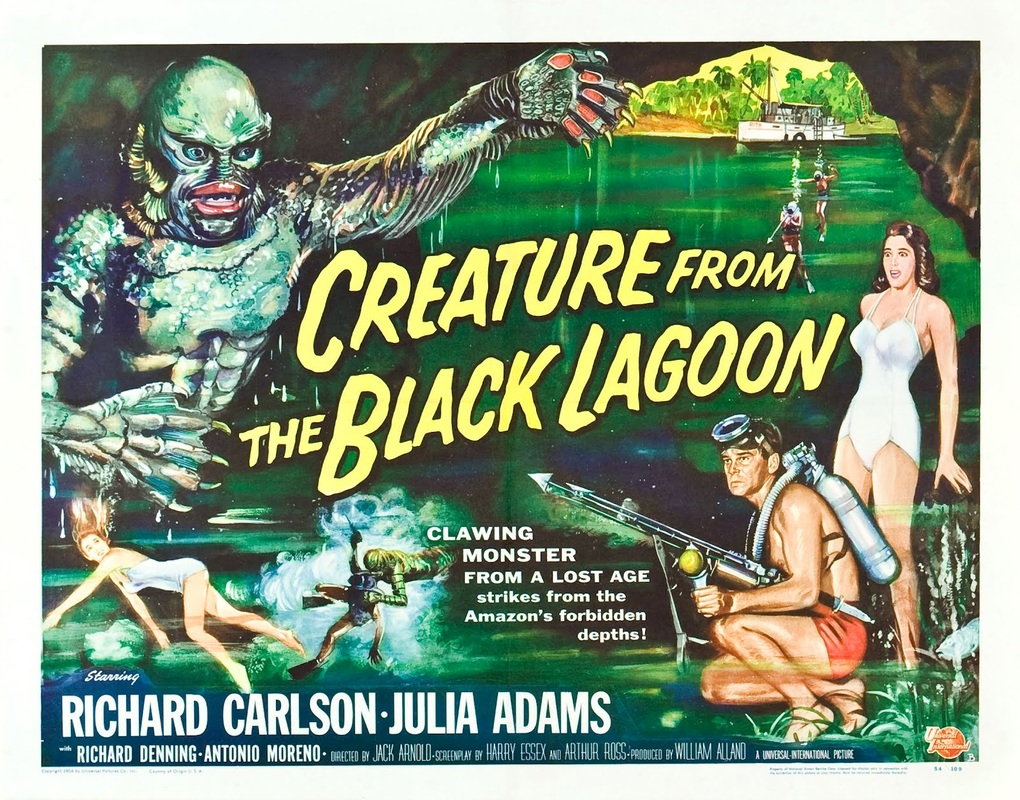
look for the true art that is hidden within the picture. do you see it ??
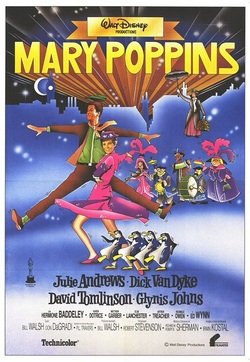
when i talk about classic i can talk about this poster. as an old and original poster i can see a beautiful artistic creative artwork that suites this story to a t.
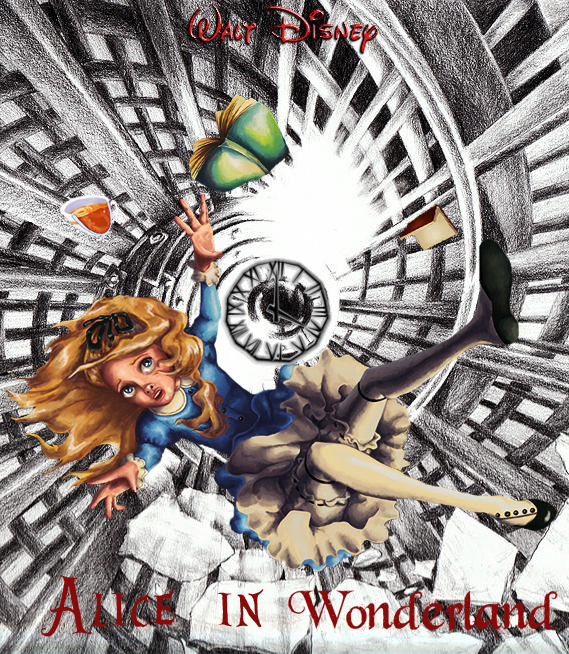
with all the studying of posters here is my creation by using my imagination and vision of the movie Alice in wonderland. this is a classic film and i truly liked the way the imagination comes into play and the open mindedness that can be displayed.